
"At Whiteframe, we design fast, modern websites that combine visual impact with real-world performance and measurable business growth."
Brutalism Breaks the Rules—Intentionally
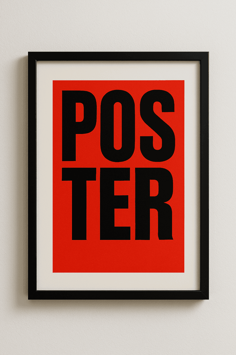
Minimal styling, clashing colors, raw HTML elements—brutalist web design isn’t afraid to look rough. But is it genius design disruption or just chaos?
What Is Brutalism in Web Design?
Inspired by mid-20th-century architecture, brutalist design embraces a raw, functional, anti-aesthetic approach. It often rejects typical design polish in favor of stark layouts, bold typography, exposed grids, and minimal CSS.
It stands out—and that’s the point. Brutalism can grab attention fast, but its usability often sparks debate.
The Appeal: Why Brands Choose Brutalism
Authenticity over polish
Brutalist sites can feel raw, honest, and real—breaking from the overly “slick” look of most modern designs.Rebellion against uniformity
In a sea of similar-looking websites, brutalism stands out as a statement of individuality.Developer-friendly
Less styling means faster build times and often faster performance.Cultural relevance
Popular with art, tech, and indie communities who value function and content over visual perfection.
But What About UX?
Here’s where brutalism divides opinion. While it can feel edgy, it may:
Confuse users
Unconventional layouts and unpredictable UI can hurt navigation and usability.Reduce accessibility
Low contrast, chaotic elements, and missing structure can create major barriers.Ignore mobile optimization
Many brutalist sites focus on desktop-first design, which limits reach.
Striking a Balance: Brutalist-Inspired, UX-Conscious
Modern designers are blending brutalist flair with UX best practices:
High-contrast, readable typography
Keep the edge, but ensure clarity.Intentional grid-breaking
Break layouts selectively to create emphasis without sacrificing structure.Responsive minimalism
Use brutalism's raw aesthetic while ensuring usability on all devices.Clear CTAs and navigation
Even experimental designs must guide users efficiently.
Examples of Brutalist Web Design
Bloomberg’s 2016 redesign shocked the design world with its bold, grid-heavy brutalist look.
nexus.larvalabs.com is a pure brutalist project that plays with raw HTML and minimal design effort.
brutalistwebsites.com showcases dozens of real-life examples embracing the style.
Final Thoughts
Brutalism in web design is deliberate defiance. It’s bold, raw, and memorable—but when pushed too far, it can alienate users. The key is intention: if your design communicates your brand and still respects usability, brutalism can be more than a trend—it can be your edge.


Let’s keep in touch.
Discover more about high-performance web design. Follow us on Twitter and Instagram.
