

"At Whiteframe, we design fast, modern websites that combine visual impact with real-world performance and measurable business growth."
Typography Shapes Online Experiences
Typography isn’t just about picking a pretty font—it defines how users feel, engage, and interact with your content. And it’s evolving fast.
Why Typography Matters More Than Ever
In a digital-first world, text must do more than deliver information—it must communicate personality, guide users, and enhance usability. As screen sizes and user expectations change, typography plays a central role in creating meaningful, accessible web experiences.
Typography Trends That Will Shape the Future
1. Variable Fonts for Performance & Flexibility
Variable fonts let designers adjust weight, width, and slant using a single file—reducing load times while giving full control over style and responsiveness.
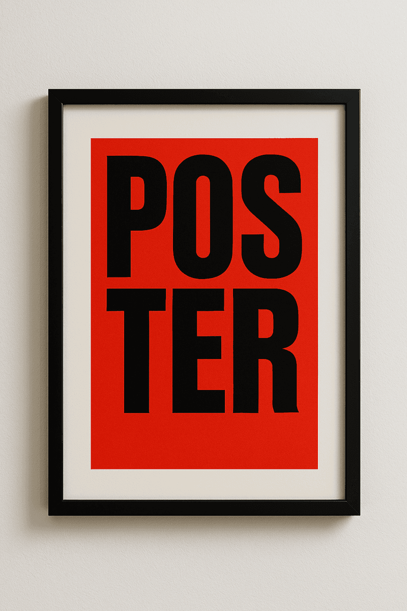
2. Maxi Typography & Bold Headlines
Oversized, eye-catching type is dominating modern interfaces. It draws attention, sets tone instantly, and looks fantastic on both mobile and desktop.
3. Kinetic Typography (Motion Type)
Text that moves—subtly or dramatically—adds energy and interactivity to UI. Used sparingly, it can elevate storytelling and brand engagement.
4. Monospace and Retro Fonts
Inspired by code and vintage interfaces, monospace and nostalgic typefaces are trending for tech products, developer tools, and design-forward brands.
5. Minimal Serif Comeback
Sleek, readable serifs are reappearing on the web, blending tradition with modern design. They evoke elegance, trust, and editorial authority.
Typography and Accessibility
As designers experiment with new styles, legibility and accessibility must remain priorities. Best practices include:
Maintaining high contrast ratios
Using sufficient line spacing and size for readability
Avoiding decorative fonts for body text
Testing responsive scaling on all devices
Accessible typography improves usability for all users, including those with visual or cognitive impairments.
Tools & Technology Shaping the Future
Google Fonts & Adobe Fonts now support a wider range of variable and experimental typefaces.
CSS clamp() and fluid typography allow type to scale intelligently across breakpoints.
Design systems like Figma and Framer increasingly prioritize typography tokenization and modular scales.
Final Thoughts
Typography is no longer a background element—it’s a core design strategy. Future-forward type choices impact everything from user experience to brand identity and SEO. By embracing new trends and technologies while prioritizing clarity and accessibility, designers can craft web experiences that are both beautiful and functional.

Let’s keep in touch.
Discover more about high-performance web design. Follow us on Twitter and Instagram.
